
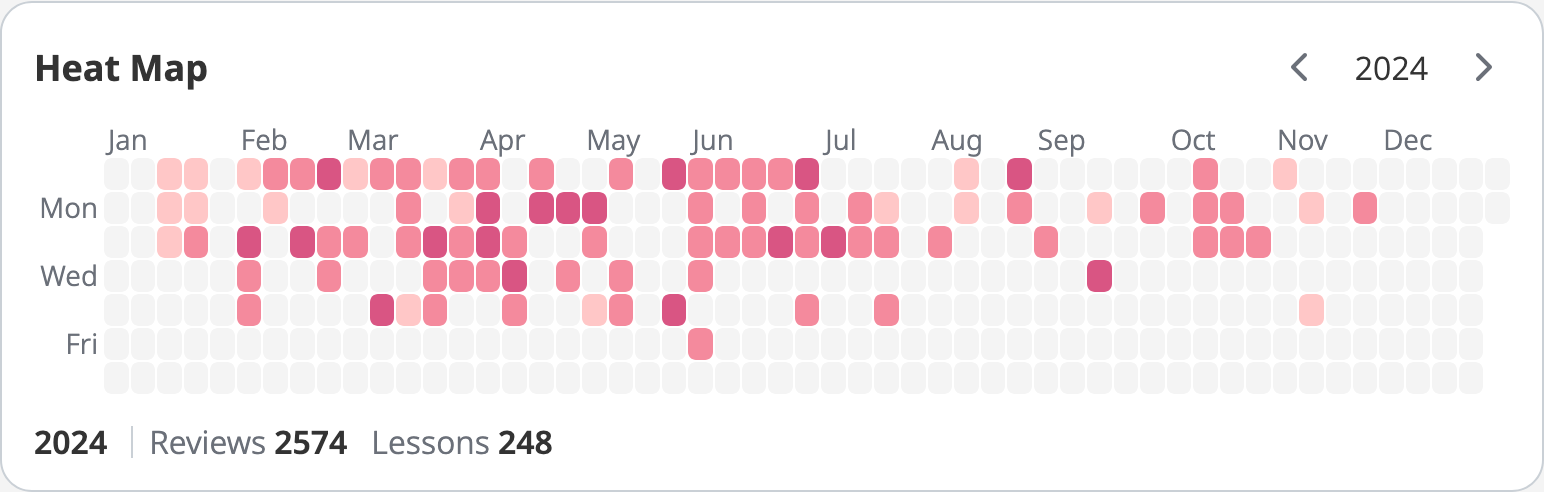
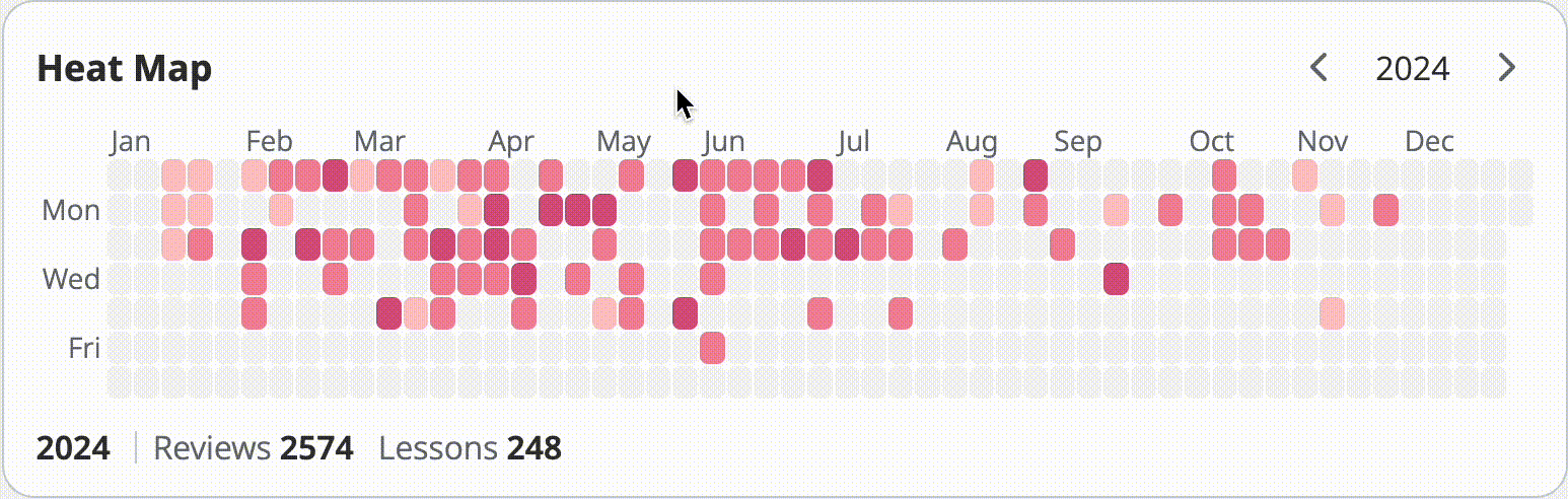
Heat Map
The Heat Map widget gives you a bird’s-eye view of your study progress. Each day you study is represented by a small box, and the color’s intensity within the box shows how much you accomplished. The darker the color, the more reviews and lessons you completed. This makes it easy to spot at a glance how consistent you’ve been over time and notice patterns in your learning habits.
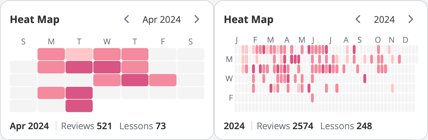
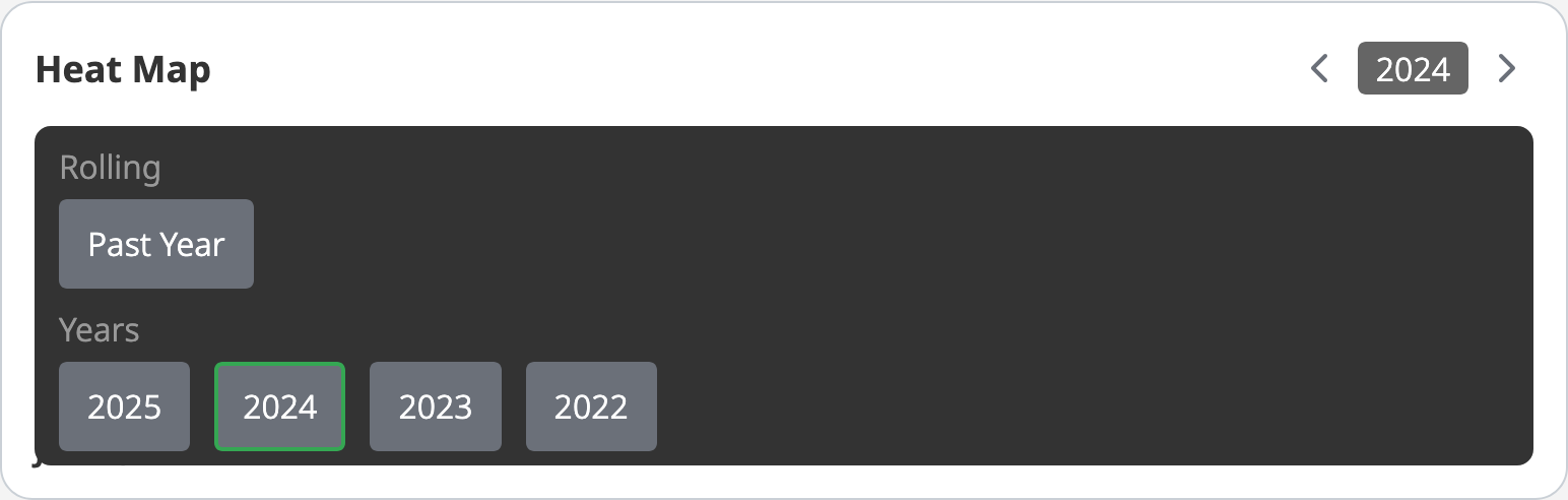
You can choose to either view your monthly or annual progress.
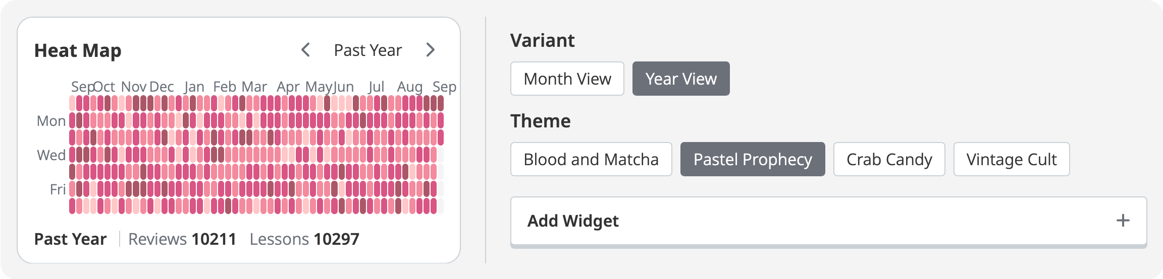
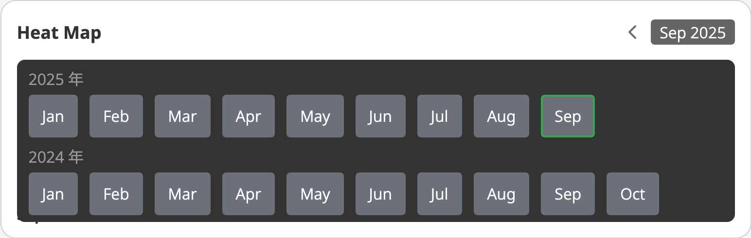
When there is not enough space to display the column titles, the text for days and months will be abbreviated:
Four color themes are also available for you to customize the widget. Note that in the annual view, “past year” means the last 365 days, not the previous calendar year.
At the bottom of the widget, you’ll see totals for reviews and lessons completed during the selected time period. Hovering over any box shows you the exact numbers for that day, and clicking a box locks that day’s data in place for easy reference.
In the annual view, click on a month at the top of the chart to lock in the data for that entire month. Click on the locked month or box again if you want to unlock it and go back to hovering for data.
To navigate through the different time periods, click on either the arrows or the date in the top-right corner, and choose from the available options.
By checking your Heat Map regularly, you get to keep track of your accomplishments and potentially uncover learning patterns you might not have noticed before.